


We have had the opportunity to talk about this collection with its graphic designer Franky Claeys so that we could all figure out what was this like back then from his perspective. He has also shared with us the inspiration behind the graphics and some never seen photos of the ‘Black Palms’. We really think you’ll find it as interesting as we do and hopefully you can learn as many things as we have about Franky himself, Raf and the collection.
Enjoy.
Who is Franky Claeys? What do you do nowadays?
My initial training was as civil engineer in biogenetics. When I finished those studies I didn’t feel quite ready to be cooped up in a lab so I decided to do an additional year in industrial design. I liked it enormously but I felt it was way too slow, so I applied for an excemption so I could take two years in one. So I ended up doing the five year course in 3. When I design I tend to be very analytical and study the ‘design problem’. I always try to put myself in the place of the consumer. I’m the one who produces a ‘tailor-made’ solution for my clients.
Unintentionally I started out in fashion but later progressed to large brands like Nike, Carhartt, Levi’s,… for Mercedes-Benz I designed a 1-star michelin restaurant and had the pleasure to work for cult figures such as Yoko Ono and Michael Jackson.
(Since end 2017 Franky is also the creative director and co-owner of Everest Isles, an ecosustainable and high tech brand of beach and swim-wear from Connecticut that specializes in swimshorts but does other products such as graphic tees or shirts. You can find them in stores such as Kith, SSENSE, Matches or Barney’s.)
How did you meet Raf Simons?
When I graduated I didn’t feel that I had developed my language, my signature enough, so I decided to become an independent designer. In order to survive I had several ‘side’ jobs one of which was photography assistant for Ronald Stoops. It was there I met raf simons. He was complaining about the fact he couldn’t find anyone who knew how to design a record sleeve for his teenage summer camp collection (ss 1997).
I pointed out I had done that already and that it was dead easy.
What did you thought about Raf Simons back then?
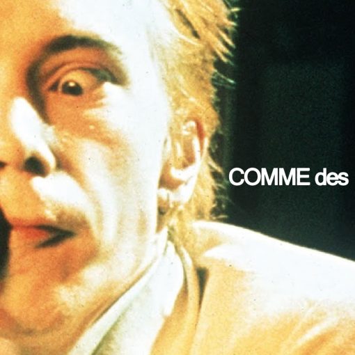
When I looked at the dna of the Raf Simons brand at the time, I felt it was a sort of a ‘punk de luxe’, rough in a luxury edition. Also everyone knew he was gay, but he kept denying it and even had a relationship with Veronique Branquinho, probably her way to get higher up in the fashion industry. So I saw his collections as his sexual fantasies. Opposed to others designers like Dirk Bikkembergs who went for bronzed sporty muscle guys, Raf went for the twink : the slim pale teenager untouched by facial hair. The schoolboys, the tall skaters with the long hair and the big dong,the rebellious punk,…. it felt an easier offering, something that was easier to relate to as a ’normal’ person. You didn’t have to look like a demigod.
How did ‘Black Palms’ come true?
The initial inspiration for the ‘Black Palms’ collection were photographic wallpapers, which were hugely popular in the late seventies and early eighties. They often featured forests and tropical beaches. It was the picture of a tropical beach that formed the basic idea for the collection. Whilst discussing the collection with Raf I decided to infuse the whole idea with visuals, specifically the blistering heat of Brian de Palma’s “Apocalypse now”. Hence the choice of the intense red sunset which only leaves the black silhouettes of the palm trees. The name itself was inspired by Oliver Stone’s TV series wild palms, his personal attempt at a sort of ‘twin peaks’. When Raf saw a VHS of the show lying about in my apartement he wanted to call the collection ‘wild palms’ but since this wasn’t the best idea from a copyright viewpoint i suggested to call it ‘black palms’ in line with the idea for the graphic.
The palms for the black palms logo and the palm island were hand drawn in pencil and coloured in with indian ink.
How did it feel to be part of such a groundbreaking moment in fashion’s history?
When we did the black palms show there were at most 7 or 8 of us to do everything. So it was hard work and long nights and when you are trying to hang up those tropical islands backdrops in a leaking venue (a garage at the back of la bastille) trying to get everything ready and keeping it dry, no it didn’t exactly feel groundbreaking at all. And since a lot of the stuff on show looked like stuff I wore myself as a teenager it felt like normal. Even the soundtrack to the show was what I had listened too as a teenager. Groundbreaking no, nostalgia yes.
How does an original Raf collaborator see current Raf Simons’ growth and status?
As his succes rose, he got more and more surrounded with no so intelligent (putting it mildly) people who had an opinion but no idea, no plan and very little skills. So it became increasingly difficult to execute a good idea. What also started to annoy me was the fact that more and more of the pieces in his collections were straight forward copies from items purchased in thrift stores and army stores. So when he took a break with his brand beginning of 2000 I left fashion for what it was and ventured out into other more satisfying projects.
When I see the brand today it feels like what once was a good youth house on a friday night has turned into a very sad circus. I see overworked designs that totally don’t correspond with the biosphere of youth culture. There is also a total disconnect with the target audience : those who want it can’t afford it, and those who can don’t want it. Not the best situation for a brand if you ask me…
Do not hesitate to check out Franky´s incredible work at his web.
Written by Iñaki Alaba